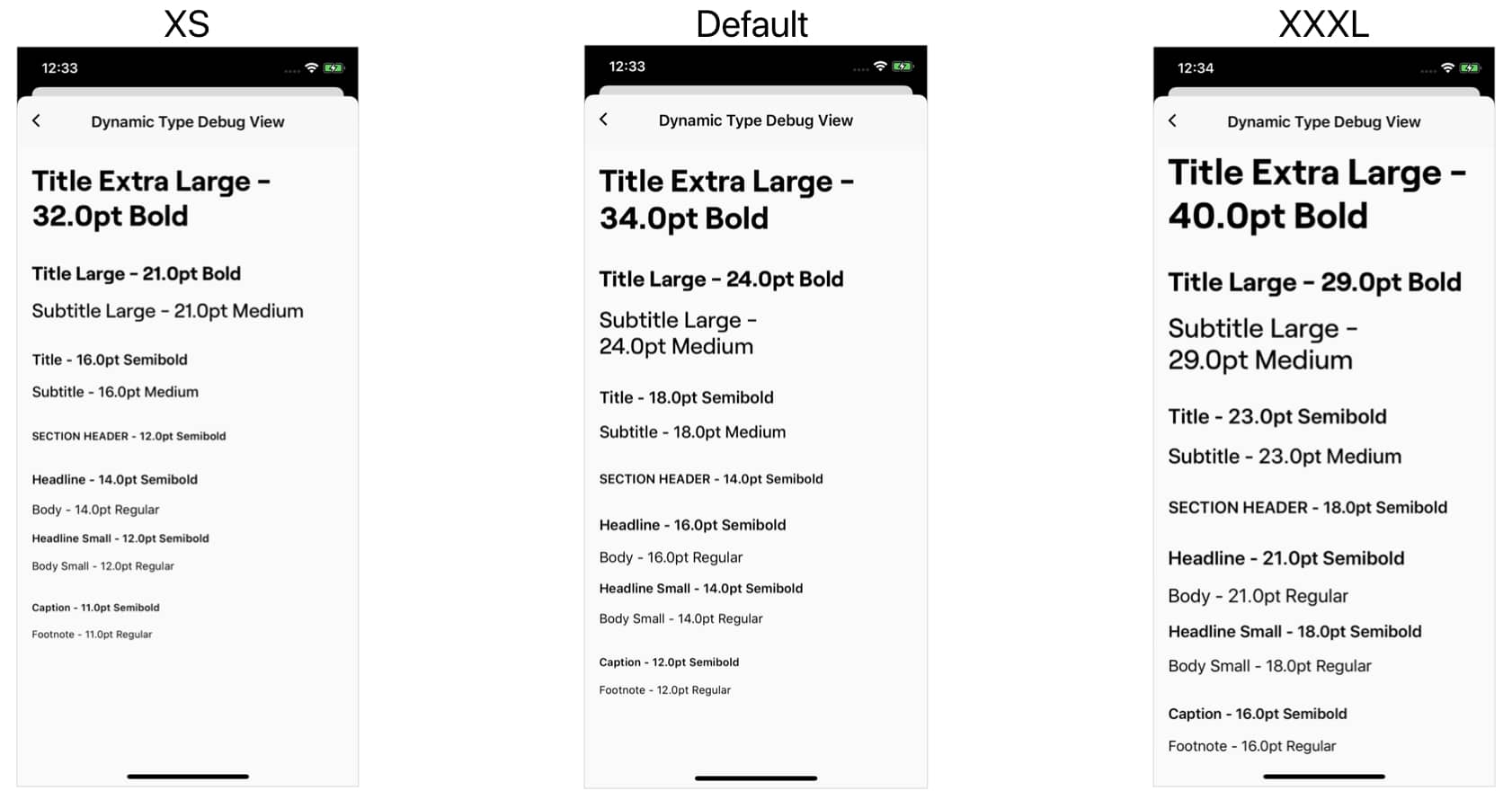
We will be working with the GitHub GraphQL API, if you want to follow along you will need to create a personal access token.
I’ve recently published a new macOS and iOS app, that allows you to prototype requests and explore GraphQL APIs. This post is meant to illustrate how you can use its features and help you get a better understanding of GraphQL.
First we will be writing a query that delivers us all the necessary information to build the search results page:
As you can see we will need five attributes of each repository: organization, name, description, number of stars, and programming language. Thanks to GraphQL’s schema, we can inspect the queries and types directly in Graphman:
Here is the query in plain text, if you would like to copy it:
query search {
search(first: 20, query: "Swift", type: REPOSITORY) {
nodes {
... on Repository {
owner {
login
}
name
description
stargazerCount
primaryLanguage {
name
}
}
}
}
}
In the query above we can see the ... on
prefix in a list of results. This is what GraphQL calls a Union, which basically is a collection of multiple types. In order for us to be able to specify the properties of the correct type we need to specify which type we are querying. Other types are ignored, or can be specified separately. In this example a search can also return users or even commits, but we only care about repositories. This is not needed for a list of homogenous result types.
Next we will write a query for the details page of a repository:
Here we need a few more properties than we requested for the search overview. But the return type will still be a Repository
so we can use the same properties and add the ones we are missing in a new query:
Here is the query in plain text, if you would like to copy it:
query repository_details {
repository(owner: "apple", name: "swift") {
owner {
login
}
name
description
homepageUrl
stargazerCount
forkCount
viewerHasStarred
viewerSubscription
pullRequests {
totalCount
}
watchers {
totalCount
}
licenseInfo {
name
}
ref(qualifiedName: "main") {
target {
... on Commit {
history {
totalCount
}
}
}
}
}
}
GraphQL, as the name might suggest, allows user to access the Graph structure of an API. This means nodes can have other nodes. In this specific example we are able to query a list of branches and their list of commits. Here we only care about the totalCount of commits, but we could very well paginate through the list of commits on multiple branches.
Lastly we will make a query to request all open pull requests for a given repository:
For this we will be using the same initial query, but will be using completely different properties. Illustrating the flexibility of a single GraphQL type, which can be used in many different circumstances, while only delivering the info that is needed:
Here is the query in plain text, if you would like to copy it:
query pull_requests($owner: String!, $name: String!, $states: [PullRequestState!]) {
repository(owner: $owner, name: $name) {
pullRequests(first: 20, states: $states, orderBy: {
field: CREATED_AT, direction: DESC
}) {
nodes {
number
title
createdAt
comments {
totalCount
}
state
}
}
}
}
In order to query the status of the last check we can query this on the last commit. Simply add the below snippet as part of what you are querying on the PullRequest
type:
commits(last: 1) {
nodes {
commit {
status {
state
}
}
}
}
I wanted to draw special attention to the usage of variables in the above query. In the previous two you saw how we can embed query input directly into the query, this time around we made the query more reusable by extracting the variables. You can see the box below the query is where we can specify these in Graphman. The variables are expected to be in standard JSON format.
I hope this was a good overview to show you the flexibility of GraphQL and how you can explore APIs with the help of Graphman. This API type is not limited to only the GitHub API, more and more companies are adopting it. Some publicly available GraphQL APIs include Yelp, Braintree, GitLab, Shopify, etc.
]]>some View
type, which is used for the body
of SwiftUI View structs.
In this article I’ll cover the common pitfalls that we encounter as a result of this opaque type, where it can be use, and how we can get around its limitations.
Most common throughout SwiftUI is the body
property which makes use of this new some View
type:
var body: some View {
VStack {
// Your layout
}
}
This works without issues, as it is a computed property and contains only a single sub-type. But if you want to use this with a stored property, you run into the following issue:
// Property declares an opaque return type, but has no
// initializer expression from which to infer an underlying type
var cell: some View
Since View
is just a protocol to which many types adhere, one might think that we could just use it as our type here. However does not work as expected, as it has associated type requirements:
// Protocol 'View' can only be used as a generic constraint
// because it has Self or associated type requirements
var cell: View
In order to solve the issue of type inference we either need to initialize it right then and there, or we can use a generic approach to infer the type at a later point:
struct SectionView<CellContent: View> {
var cell: CellContent
}
Even though we can substitute any type that conforms to the View
protocol for CellContent
, once we do we are bound to that specific type. As illustrated in this code sample:
var section = SectionView(cell: Text("Lane"))
// Cannot assign value of type 'Image' to type 'Text'
section.cell = Image("firefly")
The same applies when we have more than one property of the CellContent
type within our SectionView
, since the compiler expects them to be of the same type. However we can define more than one generic View
type:
struct Cell<Content, Accessory> where Content: View, Accessory: View {
var content: Content
var accessory: Accessory
}
let cell = Cell(content: Text("San Francisco"), accessory: Image(systemName: "cloud.fog"))
Just like computed properties we can use the some View
type as a return type:
func cellContent(for item: Item) -> some View {
VStack {
// Your layout
}
}
This works just like before, as it contains only a single sub-type, in this case the VStack
, which conforms to the View
protocol. However if we add any control statements we run into issues again:
// Function declares an opaque return type, but the return
// statements in its body do not have matching underlying types
func cellContent(for item: Item) -> some View {
if horizontalSizeClass == .compact {
return VStack { ... }
} else {
return HStack { ... }
}
}
We can solve this issue with the @ViewBuilder
parameter attribute. As of Xcode 12.0 this attribute is automatically added to the body
property of all SwiftUI View structs.
@ViewBuilder
func cellContent(for item: Item) -> some View {
if horizontalSizeClass == .compact {
VStack { ... }
} else {
HStack { ... }
}
}
Note: In order for the ViewBuilder to work as intended we may not include return
.
Similar to the stored property that we looked at before, parameters have similar limitations:
// 'some' types are only implemented for the declared type
// of properties and subscripts and the return type of functions
func cell(with content: some View) -> Cell
// Protocol 'View' can only be used as a generic constraint
// because it has Self or associated type requirements
func cell(with content: View) -> Cell
Just like before we can add a generic type, but this time we only need to apply it to the function:
func cell<Content: View>(with content: Content) -> Cell
As SwiftUI is heavily influenced by the closure syntax, we often have closure parameters that then produce an output of the View
type. One could assume that since it’s the return type of the closure we should be able to use some View
? However like before we get an error:
// 'some' types are only implemented for the declared type
// of properties and subscripts and the return type of functions
func cell(content: @escaping () -> some View) -> Cell
To solve this we can add the generic type to the function, and can also apply the @ViewBuilder
attribute if the content should support control statements:
func cell<Content: View>(@ViewBuilder content: @escaping () -> Content) -> Cell
The same syntax can also be used for parameters within initializers.
Opaque return types are a great tool to get around limitations of the associated type requirements of the View
protocol. However we just saw, they come with their own limitations. Fortunately Swift already provides us with great tools to combat these.
Before we dive in, here is a GIF of the finished product so you have a better understanding of what we are setting out to do:
Let’s start with looking at setting up our SidebarViewController
, which is a subclass of UICollectionViewController
and will make use of all these new APIs. First up is the Layout for the collectionView:
init() {
let layout = UICollectionViewCompositionalLayout { section, layoutEnvironment in
var config = UICollectionLayoutListConfiguration(appearance: .sidebar)
config.headerMode = section == 0 ? .none : .firstItemInSection
return NSCollectionLayoutSection.list(using: config, layoutEnvironment: layoutEnvironment)
}
super.init(collectionViewLayout: layout)
title = "Sidebar"
}
Here we are making use of the new UICollectionViewCompositionalLayout
, which lets us specify a distinct layout for each section. In this case we’re using that to set the headerMode
as the first section does not have any header, but subsequent ones will make use of the firstItemInSection
. This is the first step in making these sections collapsable.
With iOS 14 the UICollectionViewDiffableDataSource
got a new closure based initializer that allows us to pass in CellRegistrations so that we can configure the content:
private lazy var dataSource = UICollectionViewDiffableDataSource<Section, CellItem>(collectionView: collectionView) { collectionView, indexPath, item in
if item.isHeaderItem {
let headerRegistration = UICollectionView.CellRegistration<UICollectionViewListCell, CellItem> { cell, indexPath, item in
var configuration = cell.defaultContentConfiguration()
configuration.text = item.title
configuration.textProperties.font = .title
cell.accessories = [.outlineDisclosure()]
cell.contentConfiguration = configuration
}
return collectionView.dequeueConfiguredReusableCell(using: headerRegistration, for: indexPath, item: item)
} else {
let cellRegistration = UICollectionView.CellRegistration<UICollectionViewListCell, CellItem> { cell, indexPath, item in
var configuration = cell.defaultContentConfiguration()
configuration.text = item.title
configuration.textProperties.font = .headline
configuration.secondaryText = item.subtitle
configuration.image = item.image
configuration.imageProperties.maximumSize = CGSize(width: 44, height: 44)
cell.contentConfiguration = configuration
}
return collectionView.dequeueConfiguredReusableCell(using: cellRegistration, for: indexPath, item: item)
}
}
The Section
and CellItem
are custom types that conform to Hashable which then allows us to use these for the generic template types provided. The item
, which we can access within the closure, is of type CellItem
and has a boolean flag to let us know if it is a header item or a regular list item. We then use this to determine which configuration we apply to the cell.
The UICollectionView.CellRegistration
is another closure based API which, again, is generic in nature and we can pass our own types to it. Here I’m using the UICollectionViewListCell
which is already included in UIKit, but if you need something more custom you can pass your own Cell class as long as it is a subclass of UICollectionViewCell
.
Interesting to note is the configuration approach, as it exposes only certain properties of the cell. This is made possible by the UIListContentConfiguration
protocol. However it does not (yet) give access to all properties, for example the outlineDisclosure
accessories has to be set directly on the cell. Furthermore don’t forget to assign your finished configuration to the contentConfigutation
of the cell.
Now that we have our data source setup to configure our cells, we need to add some sections and items. We do that through a snapshot which is then applied to the data source, like so:
private var sections = [Section]() {
didSet {
applySnapshot()
}
}
private func applySnapshot() {
var snapshot = NSDiffableDataSourceSnapshot<Section, CellItem>()
snapshot.appendSections(sections)
for section in sections {
guard let sectionTitle = section.localizedTitle else {
snapshot.appendItems(section.items, toSection: section)
dataSource.apply(snapshot)
continue
}
var sectionSnapshot = NSDiffableDataSourceSectionSnapshot<CellItem>()
let headerItem = CellItem(title: sectionTitle, subtitle: nil, image: nil, isHeaderItem: true)
sectionSnapshot.append([headerItem])
sectionSnapshot.append(section.items, to: headerItem)
sectionSnapshot.expand([headerItem])
dataSource.apply(sectionSnapshot, to: section)
}
}
As you can see we create and apply a new snapshot every time our sections change. And, since we previously told our collectionView that we’ll be using the first cell as a header item in certain sections, we need to create a header item and make use of the new NSDiffableDataSourceSectionSnapshot
. First, we make sure that our section has a title. If it doesn’t, we simply use the old way of applying the section items to the section directly. However, if we do have a title, we create a headerItem and a sectionSnapshot in which we apply the items to the headerItem directly. We also let the sectionSnapshot know that the headerItem can be used to expand (and collapse) the section. Finally we apply this new sectionSnapshot to our dataSource for the given section.
In order to get the reduced width Sidebar appearance seen above we need to embed the SidebarViewController
in a SplitViewController
, we do this in our AppDelegate
or SceneDelegate
depending on what you use:
let splitView = UISplitViewController(style: .doubleColumn)
splitView.setViewController(SidebarViewController(), for: .primary)
// The initial ViewController for the secondary column is
// set within the SidebarViewController
splitView.setViewController(tabBarController, for: .compact)
We’re using a doubleColumn
layout for this particular example, but the Sidebar works just as well with a tripleColumn
style as well. Furthermore we also set a ViewController for the compact
column which will be used in compact widths (iPhone, iPad multitasking). However important to note is that these are two different view hierarchies, Apple recommends to use state restoration so that users don’t loose their place in the hierarchy when transitioning between regular and compact layout, as they do with iPad split screen.
But if your app is rather large and you have not implemented state restoration, you can also use a container ViewController that switches between a SplitViewController and a TabBarController by listening to traitCollectionDidChange
. This way you can reuse the same view hierarchy between both.
Every ViewController has access to an optional splitViewController
which is present if the ViewController is wrapped into one. We can make use of that in our SidebarController for changing the secondary ViewController when the user taps on of the topLevel navigation items as follows:
override func collectionView(_ collectionView: UICollectionView, didSelectItemAt indexPath: IndexPath) {
let item = dataSource.itemIdentifier(for: indexPath)
splitViewController?.setViewController(item?.viewController, for: .secondary)
}
The SplitViewController automatically wraps its children in a UINavigationController
. However if you want these to behave the same way as in the TabBar, then you need to wrap them yourself in individual NavigationControllers. Otherwise, the splitViewController will just push the new ViewController on the existing navigation stack.
I’ve really enjoyed diving deeper into these new CollectionView APIs, and they include much less boiler plate than the old Delegate based approach. I’m happy about a change in pace, especially when it comes to CollectionViews and TableViews which make up the majority of most iOS apps. However, I am also convinced that this new closure heavy approach is better as we don’t have to deal with indices anymore which can go out of sync.
]]>This is the main class under which the properties we’ll be looking at are available. In contrast to modern Apple APIs the shared instance is accessible under the processInfo
property, which offers access to the shared process information.
This property returns an array of strings, which can be passed through Xcode schemes, XCTestplans or XCUIApplication, and even the command line. Accessing the arguments is easy and can be done as follows:
if ProcessInfo.processInfo.arguments.contains("Promo") {
TestData.create()
}
In the above example we’re using the Promo
argument to create consistent test data for screenshots.
If we need to pass more than just a flag, we can use the environment, which is a dictionary that allows us to pass String values. This is a bit more flexible as we can pass actual values, for example we could use a dedicated API key for testing:
let apiKey = ProcessInfo.processInfo.environment["apiKey"] ?? productionKey
I’m sure you have many more ideas for what these arguments and the environment can be useful. Next I want to look at places within Xcode and the XCTest framework, where we can pass these arguments.
Within the Xcode Scheme Editor we can define arguments and environment variables which are passed on launch. Very convenient here is the option to uncheck these when they are not needed.
XCTestplan is a feature that was introduced with Xcode 11, it allows us to create different configurations which are then executed with the specified tests. I’ve previously written about how I leverage these to quickly generate screenshots in multiple languages.
But in addition to the language we can also pass arguments and environment variables, which can be read through ProcessInfo. This can be particular helpful if you want to run your tests with configurations that have different arguments, or pass different environment variables. For example you could define an apiKey that also depends on the language.
If you’re not yet using XCTestplan, don’t worry. As the XCTest framework also allows to pass these variables programatically. We do this by using the XCUIApplication
as follow:
let app = XCUIApplication()
app.launchArguments.append("Promo")
app.launchEnvironment["apiKey"] = "token123"
app.launch()
Now we have seen how we can pass custom arguments and values through ProcessInfo, however there are also some default arguments and values that can be particular helpful in certain situations.
operatingSystemVersion
The operatingSystemVersion
property returns a struct, from which you can access the majorVersion
, minorVersion
, and pathVersion
. This property is often used in analytics, but can also help modify behavior of your app that depends on a certain version. However in the latter case you should consider using if @available(...)
when possible.
isMacCatalystApp
This argument is new with iOS 13.0, and can help determine if your iOS app is running as a Mac Catalyst app on macOS. You can then use this to modify styling or assets for the macOS platform.
isiOSAppOnMac
This argument is currently in beta and will become available with macOS 11. It is to indicate if your iOS app is running natively on macOS, which will be possible for Apple Silicon Macs.
thermalState
An enum which you can use to get the current thermalState of the device, the possible values are: nominal
, fair
, serious
, and critical
.
isLowPowerModeEnabled
This argument will let you know if the user has Low Power Mode enabled. When this is true your app should refrain from using too much power, and can be used to disable non-critical, but power intensive tasks.
ProcessInfo
is a powerful API that is often overlooked when we’re not working on the Command Line. However it can be helpful for many iOS applications, for example to inject consistent data for testing and screenshots, among other things. Many developers are not aware of the default values that the ProcessInfo
class offers us, even though these can be very helpful.
To get started clone this repo and compile the Swift script in terminal as follows:
$ swiftc BuildTimes.swift
Note: By default the script will store the generated data within your Documents
directory. This makes it easily accessible and can be the same across all machines. However if you prefer to store the generated .json
somewhere else you can go into the BuildTimes.swift
script and modify the func fileURL()
helper function.
Finally you need to go into the Xcode behavior settings and select the scripts to run for the corresponding trigger. I choose the endBuild.sh
script to run for both Succeeds
and the Fails
behavior.
Once you’re done with the setup, it is suggested you do a build and check your Documents directory that the output file is created without issues. If you do not see a file show up after building, double check that the path you entered was correct. You can also try to trigger the Starts
behavior manually by calling: ./BuildTimes -start
.
As soon as you have collected some data, you can ask the script to print out daily stats:
$ ./BuildTimes -list
Which will then output data in the following format:
Aug 17, 2020: Total Build Time: 45m 23s Average Build Time: 1m 12s
Aug 18, 2020: Total Build Time: 37m 43s Average Build Time: 59s
Aug 19, 2020: Total Build Time: 28m 32s Average Build Time: 45s
Aug 20, 2020: Total Build Time: 42m 54s Average Build Time: 1m 2s
Aug 21, 2020: Total Build Time: 33m 6s Average Build Time: 52s
The data is provided to you in a JSON
format. By default it can be found in your Documents
directory. This allows you to do more processing with the collected data.
The data model looks as follows:
date: String
lastStart: Date
totalBuildTime: TimeInterval
totalBuilds: Int
Here is an example of what the JSON
format looks like:
[
{
"date" : "Aug 24, 2020"
"lastStart" : 620021178.24967599,
"totalBuildTime" : 1542.219682931900024,
"totalBuilds" : 21,
},
{
"date" : "Aug 25, 2020"
"lastStart" : 620112168.20791101,
"totalBuildTime" : 104.5191808938980103,
"totalBuilds" : 2,
}
]
With this data you’ll be able to measure how much time is spent waiting for builds per day, it also calculates the average build time for each day, which can be helpful to identify trends.
Having the data available as JSON also means you can plug it into more advanced analysis, for example you can create charts to visualize it.
Personally I’ve been collecting this data for a few weeks on my work machine now, and asked co-workers to do the same. On busy days we end up waiting for over 1h on builds, with a highest average build time of around 2m. Branch switching certainly contributes to the time, as a clean might be required. I’ve also discovered that I do more builds on Fridays, compared to other weekdays.
If you have suggestions to improve the script, feel free to open a pull request.
First we will leverage URLSession
and the new Publisher API to load and transform data from the network. Here I’ve written a simple function to request JSON from a URL:
import Combine
enum DataLoader {
static func loadStores(from url: URL) -> AnyPublisher<[AppleStore], Error> {
URLSession.shared.dataTaskPublisher(for: url)
.receive(on: RunLoop.main)
.map({ $0.data })
.decode(type: AppleStore.self, decoder: JSONDecoder())
.eraseToAnyPublisher()
}
}
I personally love how easy Combine makes it to create a pipeline to transform your raw data into what you need. So let’s look at what’s going on step by step:
URLRequest
.RunLoop.main
this is important if we want to perform UI updates with the result.nil
the pipeline will stop and a failure is reported.Codable
. If you need more information on that you can check out my last post.AnyPublisher
which flattens the types and makes our result type easily accessible.Next we have a DataManager, which acts as source of truth for our SwiftUI View and is an ObservableObject
:
import Combine
class DataManager: ObservableObject {
@Published
private(set) var appleStores = [AppleStore]()
private var token: Cancellable?
func loadStores() {
token?.cancel()
let url = URL(string: "https://timroesner.com/workshops/applestores.json")!
token = DataLoader.loadStores(from: url)
.sink { completion in
if case .failure(let error) = completion {
print(error.localizedDescription)
}
} receiveValue: { [weak self] result in
self?.appleStores = result
}
}
}
Let’s step through what this class will accomplish for us. First we make this class an ObservableObject
, this will allow us to define it as a @StateObject
within SwiftUI, more on that later.
Then we declare the appleStore property as @Published
, this is very important, as otherwise SwiftUI will not update its View Hierarchy when the contents of the array change.
Next we have a Cancellable
token, this needs to be stored at the class level in order to hold onto our request and make sure it doesn’t go away before the request is finished. This is true for any Combine Publisher.
Within our loadStores
function we first cancel any unfinished requests, this is in case the user requests to load multiple times. We also define the URL from which we will be loading our data, and last we start observing our Publisher, and sink
once the request completes and when we receive a value. Here we also do error handling and assign the result to our array of appleStores when the request was successful.
Last but certainly not least we need to setup our SwiftUI view to display and request the data from our DataManager
:
struct ListView: View {
@StateObject var dataManager = DataManager()
var body: some View {
List(dataManager.appleStores) { store in
Text(store.name)
}.onAppear {
dataManager.loadStores()
}
}
}
We’ve already done most of our work, so displaying and requesting the data within this SwiftUI view is very concise, thanks to our DataManger
which is doing the heavy lifting. Again let’s look at what is going on in detail: First we create an instance of our DataManager
and mark this property with @StateObject
, this tells SwiftUI to observe updates from this object. Furthermore it allows us to retain this property even after SwiftUI is done rendering the view. This is very important as we don’t store the property anywhere else, and it would otherwise be released.
Within our body we then list out the names of all the stores we get from the DataManager
, this will be recreated once new data is published. And finally we use the SwiftUI onAppear
handler to start loading our stores from the network. This will happen when the view first appears, the user comes back from the background, or we navigate back to this view through a NavigationView. Additionally we could implement a “Refresh” button to allow the user to trigger a manual refresh, however Apple Store data doesn’t change that frequently, so it is left out of the example.
Leveraging the power of Combine, paired with SwiftUI’s state management, we are able to separate view, data, and networking into completely separate components. I’m really enjoying how all these pieces come together and build this architecture that has a single source of truth and can still be reused and injected into subsequent views.
]]>First let’s look at decoding some JSON that matches our data model almost exactly:
[
{
"title": "Gone Girl",
"release_year": 2014,
"dir": "David Fincher"
},
{
"title": "The Social Network",
"release_year": 2010,
"dir": "David Fincher"
}
]
struct Movie: Codable {
let title: String
let releaseYear: Int
let director: String
enum CodingKeys: String, CodingKey {
case title
case releaseYear
case director = "dir"
}
}
func decodeMovies(from jsonData: Data) -> [Movie] {
let decoder = JSONDecoder()
decoder.keyDecodingStrategy = .convertFromSnakeCase
do {
return try decoder.decode([Movie].self, from: jsonData)
} catch {
print(error.localizedDescription)
return []
}
}
With the JSON given above we encounter two issues. First the use of snake case within the JSON and camel case within our own Swift struct. In order to solve this, we tell our JSON decoder to use the .convertFromSnakeCase
decoding strategy.
Second the JSON uses an abbreviation for the director key ("dir"
). In order to solve this issue we add an enum CodingKeys
to our data model, where we can define the string key used within the JSON, and our decoder will use this to automatically map between these keys.
Furthermore we tell the decoder that we expect an array of movies, this works great if we have a flat data source.
With a nested JSON we often have to create helper structs that we can use to get to our data source, like so:
{
"response": {
"status": 200,
"date": 1593905049
},
"data": [
{
"title": "The Martian",
"author": "Andy Weir",
"release_year": 2011
},
{
"title": "The Circle",
"author": "Dave Eggers",
"release_year": 2013
}
]
}
struct Book: Codable {
let title: String
let author: String
let releaseYear: Int
}
private struct Root: Codable {
let data: [Book]
}
func decodeBooks(from jsonData: Data) -> [Book] {
let decoder = JSONDecoder()
decoder.keyDecodingStrategy = .convertFromSnakeCase
do {
let root = try decoder.decode(Root.self, from: jsonData)
return root.data
} catch {
print(error.localizedDescription)
return []
}
}
In this example our data is nested within the JSON. Additionally we get some response data from the backend that we do not need for our model. We can safely ignore that and create a helper struct that only unwraps the books information from the nested data object. I declared the Root struct as private since it is only needed where ever we decode the JSON. Last but not least, we have a helper function that is able to return us the nested Book array given some JSON data, with the aid of the decodable Root struct.
The above strategies are most likely enough to decode 90% of the JSON you work with, however sometimes we work with data types that do not have Codable support out of the box. For these cases we have to write our own decode functions.
Next let’s look at cases where we are dealing with data types that need a custom decoder implementation. We will also be using the strategies explained above:
{
"response": {
"status": 200,
"date": 1593905053
},
"stores": [
{
"name": "Apple Union Square",
"website": "https://www.apple.com/retail/unionsquare/",
"zip_code": 94108,
"location": {
"latitude": 37.7887,
"longitude": -122.4072
}
},
{
"name": "Apple Fifth Avenue",
"website": "https://www.apple.com/retail/fifthavenue/",
"zip_code": 10153,
"location": {
"latitude": 40.7636,
"longitude": -73.9727
}
}
]
}
import CoreLocation
struct AppleStore {
let name: String
let website: URL?
let zipCode: Int
let location: CLLocation
}
private struct Root: Decodable {
let appleStores: [AppleStore]
enum CodingKeys: CodingKey {
case stores
}
init(from decoder: Decoder) throws {
let container = try decoder.container(keyedBy: CodingKeys.self)
let stores = try container.decode([StoreData].self, forKey: .stores)
appleStores = stores.map { store in
AppleStore(name: store.name, website: URL(string: store.website), zipCode: store.zipCode,
location: CLLocation(latitude: store.location.latitude, longitude: store.location.longitude))
}
}
}
private struct StoreData: Codable {
let name: String
let website: String
let zipCode: Int
let location: LocationData
}
private struct LocationData: Codable {
let latitude: Double
let longitude: Double
}
func decodeAppleStores(from jsonData: Data) -> [AppleStore] {
let decoder = JSONDecoder()
decoder.keyDecodingStrategy = .convertFromSnakeCase
do {
let root = try decoder.decode(Root.self, from: jsonData)
return root.appleStores
} catch {
print(error.localizedDescription)
return []
}
}
In this example we are using CLLoaction
within our data model, which does not have Codable conformance out of the box. This means we need to provide a custom decoding strategy. Furthermore the location is nested within our JSON, but stored as a single property within our data model. These mismatches can be handle through implementing some helper struct, which I’m once again declaring private
as they are only used to help with decoding.
The main difference to the strategies above is the implementation of init(from decoder: Decoder) throws
which is the method that is called by the JSONDecoder
. Within it we first create a container based on the CodingKeys
that we provided. As with all other Decodable implementations this does not need to be complete, but can be a subset of the keys we’re actually using. Then we decode an array of our helper struct StoreData
, which allows us to access the data with the types as it is present within the JSON. Finally we map over that array to generate our array of type AppleStore
.
These helper types and implementation of the init(from decoder: Decoder)
function make it very pleasant to decode the JSON data at the call site.
In addition to a key decoding strategy JSONDecoder
also allows us to set a custom DateDecodingStrategy
. The following strategies are provided:
// Uses the default decoding strategy provided by the `Date` type
decoder.dateDecodingStrategy = .deferredToDate
decoder.dateDecodingStrategy = .iso8601 // "2020-07-10T02:08:32+00:00"
decoder.dateDecodingStrategy = .secondsSince1970 // 1593905134
decoder.dateDecodingStrategy = .millisecondsSince1970 // 1593905134175
decoder.dateDecodingStrategy = .formatted(DateFormatter)
decoder.dateDecodingStrategy = .custom((Decoder) -> Date)
As you can see from the examples above, the Decodable
protocol is very powerful and versatile when it comes to handling JSON. I hope this reference helped to better understand how to work with our own data types and make decoding a bliss. Additionally there are many online tools that generate the necessary Swift structs based on a JSON input provided by you.
Apple just introduced iOS 14 and one of the major changes are Widgets coming to the iPhone home screen. This will be a flagship feature and users will expect your app to offer a Widget as well. So let’s look at how you can build one for your own app. Note: Widgets can only be built with SwiftUI as they are archived to save performance. This also means you are unable to use UIKit views, even if they are wrapped in UIViewRepresentbale
.
First off we need to add a new extension to our app. With Xcode 12 we can find a new Widget extension that will give us the building blocks to create our Widget.
When creating the extension you can choose to include Intents
, which allow your user to choose the data that is being displayed. The Weather widget for example let’s users choose which of their saved locations or if the current location should be displayed within the Widget. For this post I will focus on a static Widget that does not take Intent variables.
The first thing we need is a TimelineEntry
type. This protocol has two requirements date
and relevance
, even though the latter one has a default implementation of nil
. Additionally you should associate the data that you want to display, or at the very least the data that allows you to fetch what you want to display.
struct FlightEntry: TimelineEntry {
public let date: Date
public let flight: Flight
public var relevance: TimelineEntryRelevance?
}
All of these need to be public as the system that is interacting with your widget is not part of your app module.
Next we create a TimelineProvider
that is responsible for getting the data and establishes a timeline on which your Widget will be updated.
struct Provider: TimelineProvider {
public func snapshot(with context: Context, completion: @escaping (FlightEntry) -> ()) {
let flight = TripManager.shared.upcomingFlight()
let entry = FlightEntry(date: Date(), flight: flight, relevance: .init(score: flight.departureDate.isToday ? 50 : 500))
completion(entry)
}
public func timeline(with context: Context, completion: @escaping (Timeline<Entry>) -> ()) {
let flight = TripManager.shared.upcomingFlight()
let currentDate = Date()
let minute: TimeInterval = 60
let hour: TimeInterval = minute * 60
let entries: [FlightEntry] = (0...5).map { offset in
if flight.departureDate.isToday {
let entryDate = currentDate.addingTimeInterval(Double(offset) * 10 * minute)
return FlightEntry(date: entryDate, flight: flight, relevance: .init(score: 50))
} else {
let entryDate = currentDate.addingTimeInterval(Double(offset) * hour)
return FlightEntry(date: entryDate, flight: flight, relevance: .init(score: 500))
}
}
let timeline = Timeline(entries: entries, policy: .atEnd)
completion(timeline)
}
}
Let’s dive deeper into what these two methods do. First we have snapshot
which is used when the Widget is first added to the home screen or if presented as a preview. Conveniently the context
has a isPreview
flag that allows us to check. This is important because the method will have to return very fast, so don’t fetch data from a server for the preview, but rather provide the most current data you have locally.
Second we have the timeline
method which will be called to generate a timeline on which your Widget is updated. In the example above I’m providing 6 timeline entries, where the date and relevance depends on how important the data is. If the users upcoming flight departs today I want to update the Widget every 10 minutes and provide a high relevance so that it will be moved to the top in the Smart Stack. If the upcoming flight is further in the future I’m fine with updating once an hour and being displayed further to the end of the Smart Stack.
Finally we need to provide UI for our Widget, based on the entry provided by the TimelineProvider
. Here we’ll be using some of the brand new features of Swift 5.3:
@main
struct NextFlightWidget: Widget {
private let kind: String = "next_flight_widget"
public var body: some WidgetConfiguration {
StaticConfiguration(kind: kind, provider: Provider(), placeholder: PlaceholderView()) { entry in
NextFlightWidgetView(flight: entry.flight)
}
.configurationDisplayName("Next Flight")
.description("This widget displays upcoming flight information.")
.supportedFamilies([.systemSmall, .systemMedium, .systemLarge])
}
}
We use the Widget
protocol and the @main
attribute to let the System know where to get our Widget from. We then use a StaticConfiguration
and our previously created Provider
struct to supply a FlightEntry
to us. Furthermore we add a Display Name and Description for the Widget, these will be displayed in the system UI when users first add your Widget as seen below. You are also able to provide the supported families, in my case I’m supporting all three: small
, medium
, and large
.
Then we need to create the actual View. Here I’m using the brand new @ViewBuilder
to switch on the Widget Family to provide a unique view for each:
struct NextFlightWidgetView: View {
@Environment(\.widgetFamily) var family: WidgetFamily
let flight: Flight
@ViewBuilder
var body: some View {
let flightViewModel = FlightViewModel(from: flight)
switch family {
case .systemSmall: SmallFlightWidgetView(viewModel: flightViewModel)
case .systemMedium: MediumFlightWidgetView(viewModel: flightViewModel)
case .systemLarge: LargeFlightWidgetView(viewModel: flightViewModel)
@unknown default: preconditionFailure("Unknown Widget family: \(family)")
}
}
}
Widget views have to be pure SwiftUI, so you’re not able to wrap UIKit views in UIViewRepresentable
otherwise you’ll encounter crashes when the system tries to create your view from an archive.
Furthermore not all SwiftUI views can be used within Widgets, that is due to the static nature and the use of KeyArchiver to render these. Currently these are not (yet) document, but was told in a lab that documentation will be coming soon. Until then here is a (incomplete) list of views that CANNOT be used in Widgets:
Other dynamic views like the new Map
component in SwiftUI need to be made static. We can achieve this with the help of MKMapSnapshotter
.
Let’s talk about how you can open your app at the right point after a user taps on your Widget. SwiftUI now has two new properties that we can make use of for this in particular. First the widgetURL
modifier:
.widgetURL(URL(string: "flight-status://widget/\(flight.ID)"))
With this modifier applied to our Widget view we can specify a deep link URL that will be passed to our app. In my case I’m passing the flight ID in order to open the app with the next flight details. Only one widgetURL
can exist per view hierarchy, and this is the only way we can specify links for small
Widgets, as all other will be ignored. For medium
and large
Widgets we can have multiple tap target, each of which is associated with its own URL through the new Link
struct:
Link(destination: URL(string: "flight-status://widget/\(flight.ID)")!) {
// Your View here
}
Note: During the sessions and the lab Apple was very clear that Widgets should not be used as a simple App Launcher, but rather offer valuable and glanceable information.
In order to properly preview our Widgets within Xcode 12, we now have access to a new WidgetPreviewContext
here we can define what size family we want to preview:
struct WidgetPreviews: PreviewProvider {
static var previews: some View {
Group {
SmallFlightWidgetView(viewModel: testViewModel())
.previewContext(WidgetPreviewContext(family: .systemSmall))
MediumFlightWidgetView(viewModel: testViewModel())
.previewContext(WidgetPreviewContext(family: .systemMedium))
LargeFlightWidgetView(viewModel: testViewModel())
.previewContext(WidgetPreviewContext(family: .systemLarge))
}
}
}
Here is what the UI of adding your Widget will then look like:
Voice Control, or Switch Control are examples of technologies that help users with motor disabilities. VoiceOver and Dynamic Font help people with vision impairments. While haptics and closed captions help those with hearing loss.
Apps today heavily rely on visual components and touch interactions for navigation and actions. This can get especially difficult when you don’t have these abilities. I highly encourage you to turn on Voice Over (with screen curtain) and Voice Control to better understand how these technologies are used to navigate your app.
Most APIs we’ll be looking at are grouped under UIAccessibility
. Chances are you have seen some of these already but may not know how to best use them yet.
This label will be the first thing that is read out to a VoiceOver user and is displayed to Voice Control users for elements that offer user interaction. If you use standard UIKit components you will get this for free, as long as they display some sort of text. However if you have a button that relies completely on a visual icon to convey its purpose you need to add a label yourself:
addButton.accessibilityLabel = NSLocalizedString("Add new flight", comment: "...")
We want to make sure to localize this label as well, so users whose preferred language is not English are able to understand it. Furthermore we want to be sure that we convey intent and provide context. We could have simply made the label “Add” but without the necessary visual clues it is not clear what this action might refer to.
This property is new since iOS 13 and specifically applies to Voice Control. By default Voice Control will use the accessibilityLabel
, but this optional array of Strings allows the developer to specify shorter variations that are easier to refer to by the user.
addButton.accessibilityUserInputLabels = [
NSLocalizedString("Add", comment: "..."),
NSLocalizedString("New flight", comment: "...")
]
Values are generally properties of an element that can change, for example if something is selected or not. They are read after the label and read again if they change while the element stays focused by VoiceOver. Some standard UIKit components already make use of them, but sometimes we have custom states. For those we can add a value like this:
flightCell.accessibilityValue = flight.status.localizedDescription
extension Flight.Status {
var localizedDescription: String {
switch self {
case .onTime:
return NSLocalizedString("On Time", comment: "...")
case .delayed:
return NSLocalizedString("Delayed", comment: "...")
case .cancelled:
return NSLocalizedString("Cancelled", comment: "...")
}
}
}
Hints are read last after a short pause, as long as the element is still in focus. It can be used to convey additional instructions for elements that perform an action. I personally like to include the phrase “Double tap to..”, which is in line with Apple’s system apps.
flightCell.accessibilityHint = NSLocalizedString("Double tap to view more details", comment: "...")
This array of properties defines the capabilities of an element. They are read to the user as information, but some also offer additional functionality like the adjustable
trait.
Trait | Description |
---|---|
button |
Treat element as button |
link |
A tappable link, which brings the user to a website. These can be directly navigated through with the rotor. |
searchField |
A search field |
image |
A visual graphic. Should be used when the visual appearance conveys additional information. Can be combined with other traits. |
selected |
Used to describe the state of an element. For example used for tab bar items. |
playsSound |
Element plays a sound once the action is performed |
keyboardKey |
Treat element as a keyboard key |
staticText |
Text that cannot change |
summaryElement |
Element provides summary information, which is read on first load. Each view may only have one summary element. |
notEnabled |
Element is disabled and does not respond to user interaction. Read out as “dimmed”. |
updatesFrequently |
Element frequently updates its label or value. Makes sure that VoiceOver doesn’t fall behind when reading updates. |
startsMediaSession |
Causes VoiceOver to not read back the element when activated, so the sound can play without interruptions. |
adjustable |
Allows adjustments through increment and decrement methods. Will append “, swipe up or down to adjust the value.” to your hint. |
allowsDirectInteraction |
Useful for drawing apps or other elements where interactions can not be controlled by VoiceOver. |
causesPageTurn |
Element causes an automatic page turn when VoiceOver finished reading it |
header |
Divides content into sections. These can be directly navigated through with the rotor. |
This is a boolean that should be set on a view that is presented modally on top of another. This is important because by default all elements on screen can be navigated to with VoiceOver. Setting this property to true tells VoiceOver to ignore elements that are not part of the view’s hierarchy.
modalViewController.view.accessibilityViewIsModal = true
modalViewController.modalPresentationStyle = .overCurrentContext
present(modalViewController, animated: true, completion: nil)
Most VoiceOver users swipe horizontally to navigate through the different elements within your app. Having to step through every label can take a while and also confuse users when information that belongs together visually is not grouped together when navigating with VoiceOver. To solve this we need to group information that belongs together.
If you already group these elements together in the same parent for layout purposes then you can simply do the following:
// containerView subviews: nameTitleLabel, nameLabel
containerView.isAccessibilityElement = true
containerView.accessibilityLabel = "\(nameTitleLabel.text ?? ""), \(nameLabel.text ?? "")"
Setting the isAccessibilityElement
to true on the containerView will automatically hide the subviews, nameTitleLabel
and nameLabel
, from VoiceOver. We then compose the container’s accessibility label from the text of the two contained labels. Adding a comma between the two adds a pause while VoiceOver reads them out.
However wrapping all your views that belong together in a container view might clutter your view hierarchy. As a second option we can group elements by providing a custom array of accessibilityElements
:
override var accessibilityElements: [Any]? = {
let nameElement = UIAccessibilityElement(accessibilityContainer: self)
nameElement.accessibilityLabel = "\(nameTitleLabel.text ?? ""), \(nameLabel.text ?? "")"
nameElement.accessibilityFrameInContainerSpace = nameTitleLabel.frame.union(nameLabel.frame)
let cityElement = UIAccessibilityElement(accessibilityContainer: self)
cityElement.accessibilityLabel = "\(cityTitleLabel.text ?? ""), \(cityLabel.text ?? "")"
cityElement.accessibilityFrameInContainerSpace = cityTitleLabel.frame.union(cityLabel.frame)
return [nameElement, cityElement]
}()
Here we create UIAccessibilityElements, which are only visible to VoiceOver, and group the labels that belong together. But since it is not a UIView, we have to manually provide the frame of the element. This is important so that VoiceOver knows what elements to focus after it received a touch event at a certain location.
Also notice how this is NOT a computed property, since VoiceOver expects a consistent array of acccessibilityElements
. If your elements and labels might change while they are on screen, then it is best to have a cache of accessibilityElements
which can be set to nil
once a change occurred.
Looking at the Accessibility section within the system settings, we can see a lot of features that can be turned on or off by the user. Additionally these user settings are also exposed to developers through UIAccessibility
, so that third party apps can adhere to them. Here is a list of all the exposed settings, as of iOS 13:
// UIAccessibility
isAssistiveTouchRunning
isBoldTextEnabled
isClosedCaptioningEnabled
isDarkerSystemColorsEnabled
isGuidedAccessEnabled
isGrayscaleEnabled
isInvertColorsEnabled
isMonoAudioEnabled
isReduceMotionEnabled
isReduceTransparencyEnabled
isShakeToUndoEnabled
isSpeakScreenEnabled
isSwitchControlRunning
isVideoAutoplayEnabled
isVoiceOverRunning
UIAccessibility
also offers Notifications that can be subscribed to in order to observe changes in these settings while your app is running. Since the system already respects these settings so should we as developers within our apps. Let’s look at some of them in more detail:
This setting changes the system colors to increase contrast between text and background. If you are using custom colors you should also adjust these for higher contrast, meaning darker by default and slightly lighter in Dark Mode. Within the Xcode Asset Catalog we can find a “High Contrast” check box that then allows us to provide these variants. If you define your colors within code you can simply check this property to determine which variant to return.
Reducing motion refers to animations that involve a lot of translations and scaling. When turned on, the system replaces most of these with simple cross fade animations. If you also use animations that rely heavily on transforms in your app you should check for this property and provide crossfade alternatives.
Semi transparent backgrounds have been a heavily used design element since iOS 7. They can be nice to provide a sense of hierarchy, and make views more unique. However they don’t always offer the best contrast. When this setting is turned on, apps should always display text with a solid background and dim the background behind partial modal views to create more contrast.
For a visual user it is easy to understand when a new information appears on screen. VoiceOver users however might not have the changing element in focus, causing them to miss this information. For those changes we can post one of the following Notifications to UIAccessibility:
UIAccessibility.post(notification: .layoutChanged, argument: updatedView)
UIAccessibility.post(notification: .screenChanged, argument: newScreen)
UIAccessibility.post(notification: .announcement, argument: NSLocalizedString("Your Announcement", comment: "..."))
Most of the time you will post the layoutChanged
Notification, here you can pass the subview that has changed or newly appeared on screen and VoiceOver will directly focus on it and read it to the user. If you pass nil
it will simply focus on the first view in the hierarchy.
The screenChanged
Notification is useful when you present a new ViewController as modal. If it’s not a modal presentation VoiceOver will automatically focus on the new screen.
Lastly the announcement
Notification can be used to read out text to the user, this can be useful when there is no UI change, or a temporary view is displayed, for example a toast.
The following are some gestures VoiceOver users can perform to interact with certain elements more directly. It is helpful to add a hint to the element that you are implementing these gestures for.
As discussed above, an element can be adjustable–for example, a stepper where the user increments and decrements the value. This can also be used to navigate through a carousel view, or if you have a custom input view like a rating. Once you set the adjustable
trait on the element, the system automatically appends to your hint, and you can override the following two methods to implement your custom increment / decrement behavior:
override func accessibilityIncrement() {
...
}
override func accessibilityDecrement() {
...
}
This gesture can be performed by drawing a “Z” shape with two fingers. It is commonly used to escape a modal alert, or otherwise dismiss a view that doesn’t have a dedicated dismiss button. There is no trait for this gesture, so be sure to include a hint.
override func accessibilityPerformEscape() -> Bool {
// return true if dismiss was successful
}
This gesture can be performed with a two finger double tap, and should perform the main action of the app. If you have a music or podcast app this might be play / pause, or the phone app for example uses it for answering phone calls and hanging up. The implementation will therefor entirely depend on your app’s functionality.
override func accessibilityPerformMagicTap() -> Bool {
// return true if the action was successful
}
If the above gestures didn’t cover all your use cases you can also implement Custom Actions. You can specify a name for those and they can be navigated with a swipe up or down and executed with a double tap. For example if you offer actions through a long press or context menu, then those should be exposed as custom actions so they can be performed by assistive technologies as well.
airportView.accessibilityCustomActions = [
UIAccessibilityCustomAction(name: NSLocalizedString("View in Maps", comment: "..."), actionHandler: { [weak self] in
self?.viewInMaps(airport.address)
})
UIAccessibilityCustomAction(name: NSLocalizedString("Get Directions", comment: "..."), actionHandler: { [weak self] in
self?.getDirections(to: airport.address)
})
]
We now looked at many APIs of assistive technologies for users with motor or vision impairments. But as mentioned at the beginning, we can also improve our app for users with hearing loss. First lets look at haptics, which can be a great substitute for sound. Haptics are much more than simple vibrations, as we can adjust intensity and also produce unique and recognizable patterns. Apple provides three different UIFeedbackGenerators
that are used to produce these haptic feedbacks:
// Selection
let selectionGenerator = UISelectionFeedbackGenerator()
selectionGenerator.selectionChanged()
// Notification
let notificationGenerator = UINotificationFeedbackGenerator()
notificationGenerator.notificationOccurred(.success)
notificationGenerator.notificationOccurred(.warning)
notificationGenerator.notificationOccurred(.error)
// Impact
let lightImpactGenerator = UIImpactFeedbackGenerator(style: .light)
lightImpactGenerator.impactOccurred()
let mediumImpactGenerator = UIImpactFeedbackGenerator(style: .medium)
mediumImpactGenerator.impactOccurred()
let heavyImpactGenerator = UIImpactFeedbackGenerator(style: .heavy)
heavyImpactGenerator.impactOccurred()
The above code generates 7 different haptic feedback patterns. The Notification Generator can be reused as the style is passed in with the trigger function, while the Impact Generator has the style directly associated with the generator. If you do reuse the generator you can call prepare()
which will put it in an alert state to help execute the triggered pattern quicker. However you need to be careful as the Haptic Engine will only stay in a prepared state for a few seconds. And calling it right before the trigger action will not result in any improvements.
For more custom patterns you can use CoreHaptics
which provides you with a CHHapticEngine
.
As developers we want to make our apps accessible to the widest audience possible. With the APIs and technologies covered above you can greatly improve the accessibility of your app. It may seem daunting, especially if this is your first time getting to know these technologies. But even implementing just a few of these APIs will open your app to a wider audience. As you become more familiar with these technologies, you’ll be able to spot issues right away and build new features for all.
]]>With the redesign last summer, we started using our own custom font, Roobert, which is used across all platforms. Additionally, we defined standard text styles, which are now used across the app. We also focused on accessibility, including adjusting our colors to improve contrast ratios between text and background, as well as adaptable font sizing.
Making app-wide changes like this doesn’t come easy. The Twitch app has many different screens and text labels, all of which need to work with scaled font sizes, on both iPhone and iPad, across many screen sizes. Fortunately the initial support for Dynamic Type can be centralized.
Starting with iOS 11, UIKit has exposed UIFontMetrics
, which we can use to scale our custom font to any size. It does so by applying a multiplier to the initial point size. Because we now require a minimum SDK target of iOS 11, we can simply use UIFontMetrics, without having to rely on a separate solution for older iOS versions.
let title = UIFont(name: "Roobert", size: 18)
let scaledFont = UIFontMetrics.default.scaledFont(for: title)
These two lines produce a scalable variant of our “Title” text style. However, we discovered that using the default
Font Metrics can produce results in which we get overly large titles that scale beyond what they need to, as they already start out relatively big. In order to fix this, we were able to leverage the predefined Apple text styles as template. Each one has a different scaling behavior: the smaller ones, like .footnote
and .caption
, will not go below 11pt, while the .title
styles will grow slower than the .body
or .headline
styles as they scale up.
We created the following function, which maps between our styles and the correct Font Metric we like to use.
enum TextSize: CGFloat {
case titleExtraLarge = 34
case titleLarge = 24
case title = 18
case body = 16
case bodySmall = 14
case footnote = 12
}
private func metrics(for size: TextSize) -> UIFontMetrics {
switch size {
case .titleExtraLarge:
return UIFontMetrics(forTextStyle: .largeTitle)
case .titleLarge:
return UIFontMetrics(forTextStyle: .title2)
case .title:
return UIFontMetrics(forTextStyle: .title3)
case .bodySmall, .body:
return UIFontMetrics(forTextStyle: .body)
case .footnote:
return UIFontMetrics(forTextStyle: .footnote)
}
}
The following code snippet then allows us to get a scaled UIFont with the TextSize
and font weight we specify. If you haven’t imported your custom font, follow these steps
private enum RoobertWeight {
case medium, bold
var fontName: String {
switch self {
case .medium:
return "Roobert-Medium"
case .bold:
return "Roobert-Bold"
}
}
}
func font(with size: TextSize, weight: RoobertWeight) -> UIFont {
let roobert = UIFont(name: weight.fontName, size: size.rawValue)
return metrics(for: size).scaledFont(for: roobert)
}
Once implemented, the code snippets above allow us to define a total of 12 text styles, all of which adhere to the Dynamic Font setting of the user.
At Twitch, we put these snippets into an extension of UIFont, and we gave all 12 styles distinct names so that we can easily reuse them throughout our project. Here is an example of some of these:
extension UIFont {
// more styles
static let twitchHeadline = font(with: .body, weight: .semibold)
static let twitchBody = font(with: .body, weight: .regular)
static let twitchHeadlineSmall = font(with: .bodySmall, weight: .semibold)
static let twitchBodySmall = font(with: .bodySmall, weight: .regular)
static let twitchCaption = font(with: .footnote, weight: .semibold)
static let twitchFootnote = font(with: .footnote, weight: .regular)
}
The benefit of having distinct names for our fonts also means that communication between designers and engineers is easier as we have a shared language we can all use to communicate; these styles are available in both our design tool and our code, making them a part of our design system.
While adding support for dynamic font sizing we also vetted the text styles that we previously used throughout the app and made sure they work with all sizes and hierarchy is maintained.
Furthermore we optioned to use semantic names that convey intent instead of style properties, this will allow us to adjust these properties in the future without having to change the name of the text style.
Adding support for Dynamic Type is not where the work stops, but starts. Maybe you are already localizing your app and have run into issues where labels are getting truncated. With dynamic font sizes you also have to keep in mind that text can grow vertically which can cause layout issues. You may need to add more Scroll Views, so that text at the largest sizes is still readable. Some layouts might break completely and need to be reworked. Below are some best practices that can help you tackle these newly created issues:
label.numberOfLines = 0
label.adjustsFontForContentSizeCategory = true
First we set the numberOfLines
of the label to infinity, so that we ensure all the text is presented and not truncated. Sometimes we might only preview certain text. In that case we keep a fixed maximum of lines. However we still need to make sure that it’s a big enough number, so that text at large content sizes and in other languages is still comprehendible. Second, we tell the label to automatically adjust its text with the content category. This is especially useful for debugging purposes when you want to change the content size frequently.
static var horizontalDynamic: NSLayoutConstraint.Axis {
return UIScreen.main.traitCollection.preferredContentSizeCategory > .accessibilityLarge ?
.vertical : .horizontal
}
stackView.axis = .horizontalDynamic
A practice that Apple also uses in their system apps is to change the layout axis of Stack Views once a certain size category is reached. This can be useful as horizontal space shrinks due to large text and the limited device width. Below is an example of how we can use this axis to layout the text and buttons in different size categories. Note how things move from being laid out horizontally to vertically as the scale increases.
tableView.rowHeight = UITableView.automaticDimension
tableView.estimatedRowHeight = UIFontMetrics.default.scaledValue(for: 60)
Using automaticDimension
for the Table View row height ensures that AutoLayout is used to determine the height of its cells. Furthermore we use the scaledValue(for:)
function available on all UIFontMetrics
to help the Table View with its layout. It is required that you supply an estimatedRowHeight
when using automaticDimension
and we can improve performance with passing a scaled value instead of just a static one.
func collectionView(_ collectionView: UICollectionView, layout collectionViewLayout: UICollectionViewLayout, sizeForItemAt indexPath: IndexPath) -> CGSize {
...
}
Unfortunately automatic cell sizing in Collection Views is a little harder to achieve than in Table Views, as these cells can have variable width and height. This topic alone could warrant another blog post and there are many good ones out there. At Twitch we often make the width of the cell static and then let it grow in height to accommodate its content.
scrollView.flashScrollIndicators()
With dynamic font sizes we notice that content bleeds off screen more often. To still make it readable to the user we need to wrap it into a Scroll View. With the current flat design language within iOS it’s easy to miss if a screen is scrollable, especially when it’s cut off in just the right place. In order to mitigate this, and signal to the user that there is more content off screen, we flash the scroll indicators.
Moving forward, we have to be cognizant about using AutoLayout constraints that adapt to accommodate large texts. This is easier for screens that rely on reusable components, as these are often optimized for variable text length and height. However our app has a lot of screens, which is why we scheduled time with the whole iOS team to sit down and walk through the app to identify areas that have layout issues with large text sizes. We haven’t addressed all areas yet, but are on the way to optimize every screen to deliver a consistent, and delightful experience to all our users.
]]>