Implementing UIPointerInteractions for iPad
With the release of iOS 13.4 the iPad got full mouse, trackpad and therefor also mouse pointer support. With the new Magic Keyboard accessory even more people will be using their iPad with Keyboard and Cursor, instead of touch inputs. In this post I will go over all the new APIs around pointer interactions, and point out some gotchas that will help you make your iPad app feel great when used with pointer input.
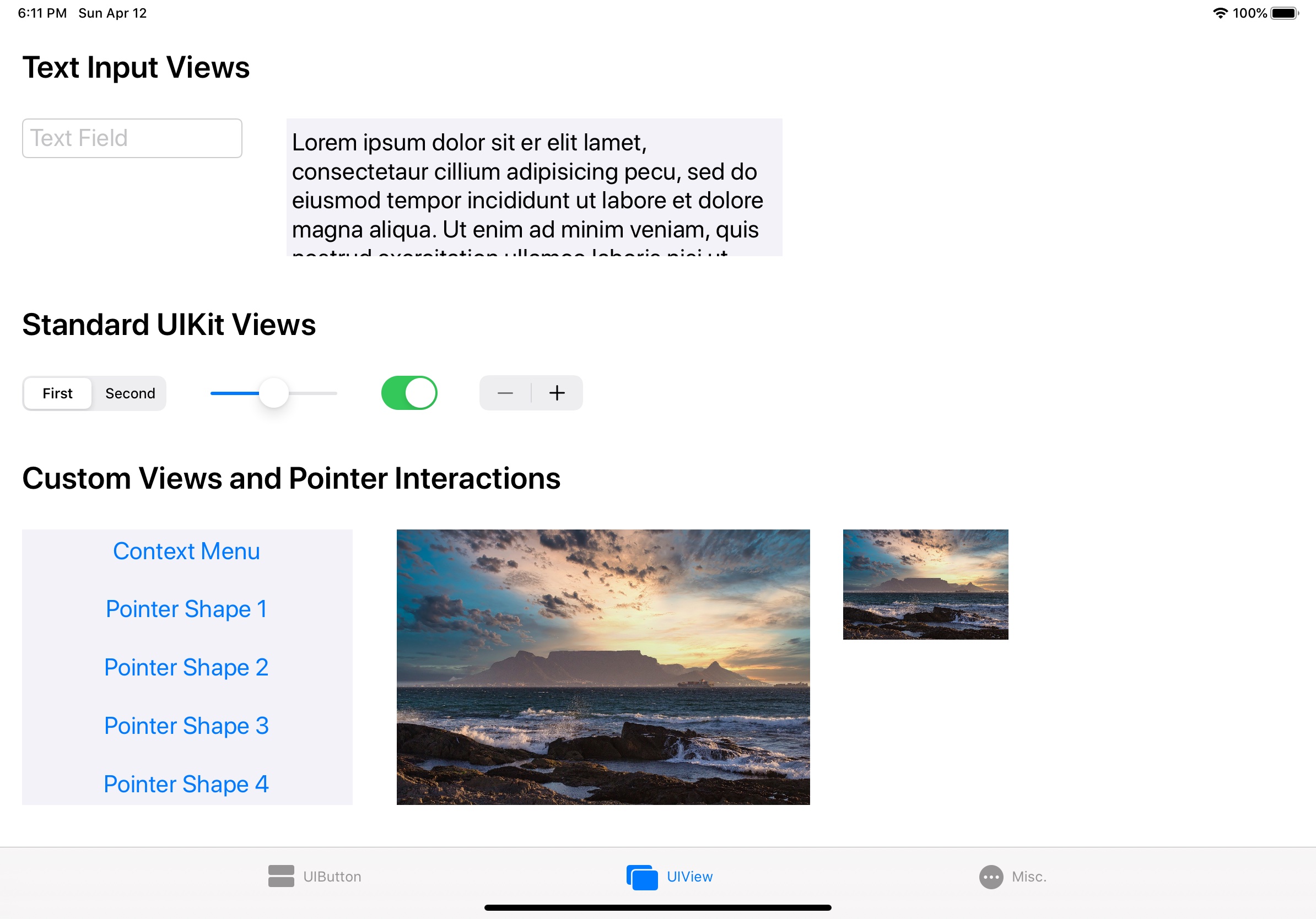
UIButton
Buttons expose the main interaction within our apps. In order to have the cursor react accordingly it’s as simple as setting the following property on UIButton:
button.isPointerInteractionEnabled = true
This will make the cursor morph and interact with your button by using the .automatic pointer effect. By implementing the following we can further customize the UIPointerStyle:
highlightedButton.pointerStyleProvider = { (button, effect, shape) in
    let targetedPreview = UITargetedPreview(view: button)
    return UIPointerStyle(effect: .highlight(targetedPreview))
}
There are four different Pointer Style effects: .automatic, .highlight, .lift, .hover. The guidance on when to use what is as following:
- Use highlight for a small element that has a transparent background.
- Use lift for a small element that has an opaque background.
- Use hover for large elements and customize the scale, tint, and shadow attributes as needed.
In addition to the targetedPreview the .hover style also takes three more parameters (preferredTintMode: TintMode, prefersShadow: Bool, prefersScaledContent: Bool), which can be used to customize the appearance further. In the following illustration you can see all the different effects in action.
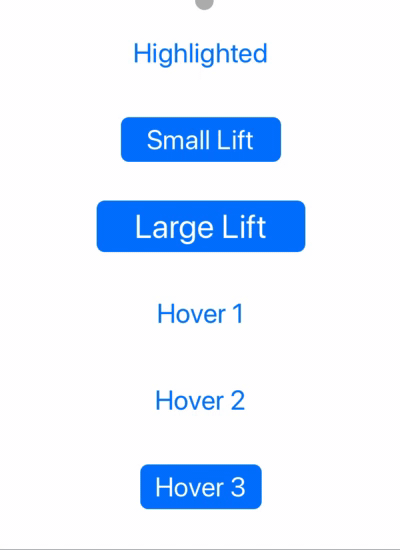
If you look closely you’ll notice that the lift effect changes appearance depending on the size of the targetedPreview. This is in line with the guidance that Apple gave in their HIG around Pointer Interactions. We’ll also be looking at how to customize the shape of the pointer, but before we’ll be looking at how to add these interactions to a subclass of UIView.
UIView
Given a subclass of UIView, for example UIImageView, we will need to add the following to enabled pointer interactions:
imageView.isUserInteractionEnabled = true
imageView.addPointerInteraction(with: self)
func addPointerInteraction(with pointerInteractionDelegate: UIPointerInteractionDelegate) {
    let pointerInteraction = UIPointerInteraction(delegate: pointerInteractionDelegate)
    self.addInteraction(pointerInteraction)
}
extension YourViewController: UIPointerInteractionDelegate {
    func pointerInteraction(_ interaction: UIPointerInteraction, styleFor region: UIPointerRegion) -> UIPointerStyle? {
        guard let view = interaction.view else { return nil }
        let targetedPreview = UITargetedPreview(view: view)
        return UIPointerStyle(effect: .lift(targetedPreview))
    }
}
The delegate method behaves the same as the pointerStyleProvider of UIButton, but is implemented at the ViewController level rather then the individual view level. It’s also very important to set isUserInteractionEnabled = true as the pointer interaction will not be visible otherwise.
You can then return a UIPointerStyle, with the same constraints and effects as in the UIButton example above. In this UIImageView example we again use the .lift effect as we’re dealing with an opaque view. UIKit automatically decides if it should hide the cursor, based on the size of the view. Unfortunately it is not documented when exactly this switch takes places, nor if it depends on area, or just height / width. Here is an illustration of an Image View with the .lift effect again in small and large:

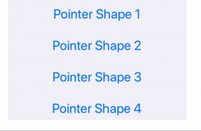
UIPointerShape
In addition to the UIPointerStyle effect we can also customize the shape of the pointer. Again we have four enum cases that are available: .roundedRect, .horizontalBeam, .verticalBeam, .path. They have different associated values which determine the look of the cursor. Here are some examples:
let pointerRect = CGRect(origin: .zero, size: CGSize(width: 25, height: 25))
return UIPointerStyle(shape: .roundedRect(pointerRect, radius: UIPointerShape.defaultCornerRadius))
let height = button.titleLabel?.font.lineHeight ?? button.frame.height
return UIPointerStyle(shape: .verticalBeam(length: height))
// Max width will be 100 points
return UIPointerStyle(shape: .horizontalBeam(length: button.frame.width), constrainedAxes: .horizontal)
// Offset is necessary so that the default pointer and this new pointer shape are algined correctly.
let paperplanePath = UIBezierPath(svgPath: .paperplaneIcon, offset: 10.0)
return UIPointerStyle(shape: .path(paperplanePath))
For converting the SVG path to a UIBezierPath I’m using this implementation from Tim Wood. Important to note is that we have to offset the shape by 10.0 in both x and y direction. Otherwise the pointer will visual be at x:0, y:0 of the path, resulting in weird jumps between the default pointer and this custom shape.
Here are these examples in action:
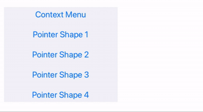
UIContextMenu
Context menus have been introduced in iOS 13.0 as part of Mac Catalyst, but are now also accessible through a right mouse click on iPad. In order for the pointer on iPad to interact with the Context Menu correctly we have to provide a UITargetedPreview through one of the optional delegate methods of UIContextMenuInteractionDelegate:
func contextMenuInteraction(_ interaction: UIContextMenuInteraction, ...) -> UITargetedPreview? {
    guard let view = interaction.view else { return nil }
    return UITargetedPreview(view: view)
}
The right click interaction works out of the box with your existing UIContextMenu, which you can add to your buttons or views as follows:
let contextMenuInteraction = UIContextMenuInteraction(delegate: self)
contextMenuButton.addInteraction(contextMenuInteraction)
Here is an example of such a context menu in combination with the iPad pointer:
UIHoverGesture
Hover Gestures are another thing that was added to UIKit as part of Mac Catalyst, but they are just as useful with the iPad pointer, and can be used to show content on hover. In order to support these, we simply add the Gesture Recognizer to the view we want to respond to hover events:
let hoverGesture = UIHoverGestureRecognizer(target: self, action: #selector(handleHover))
hoverGestureView.addGestureRecognizer(hoverGesture)
Within our handler we can then implement the custom behavior we want, in this example animate the alpha of a label:
@objc private func handleHover(_ gesture: UIHoverGestureRecognizer) {
    guard gesture.state == .began || gesture.state == .ended else { return }
    let newAlpha: CGFloat = gesture.state == .began ? 1.0 : 0.0

    UIView.animate(withDuration: 0.5) { [weak self] in
        self?.hoverLabel.alpha = newAlpha
    }
}
Here is this hover in action:
Sample App
If you want to try out all of these interactions for yourself you can clone my sample project from GitHub. It contains all the code from the examples plus it allows you to interact with the standard UIKit elements, so you can get a feel, if you need to replicate behavior for your custom components.
Next Post:

