Starting your iOS Design System
A Design System is a way to ensure that different screens of your app look consistent. This is very important if you have a big app with many screens, but even for smaller projects that are maintained over a long period, a Design System is useful especially when adding new features.
Principles
These are the corner stones of your Design System. The constructs and details that ensure consistency. Your whole project depends on these, but they do not depend on your project, making it easy to separate these into their own framework, which can also be reused across multiple projects.
Margins
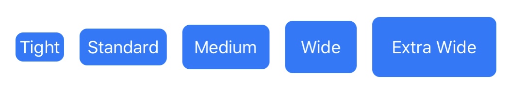
Margins define the distances between your text, images, and other components. They can also be used to add padding. I prefer to make my margins multiples of 4, so that they can easily be combined:
public extension CGFloat {
	static let tightMargin: CGFloat = 4
	static let standardMargin: CGFloat = 8
	static let mediumMargin: CGFloat = 12
	static let wideMargin: CGFloat = 16
	static let extraWideMargin: CGFloat = 20
}

public extension UIEdgeInsets {
	init(uniform: CGFloat) {
		self.init(top: uniform, left: uniform, bottom: uniform, right: uniform)
	}

	static let tightMargin: UIEdgeInsets = .init(uniform: .tightMargin)
	static let standardMargin: UIEdgeInsets = .init(uniform: .standardMargin)
	static let mediumMargin: UIEdgeInsets = .init(uniform: .mediumMargin)
	static let wideMargin: UIEdgeInsets = .init(uniform: .wideMargin)
	static let extraWideMargin: UIEdgeInsets = .init(uniform: .extraWideMargin)
}
Having these extensions on CGFloat and UIEdgeInsets then allows you to use these with your programmatic constraints, and insets. Here is how the different values compare to each other:
Text Styles
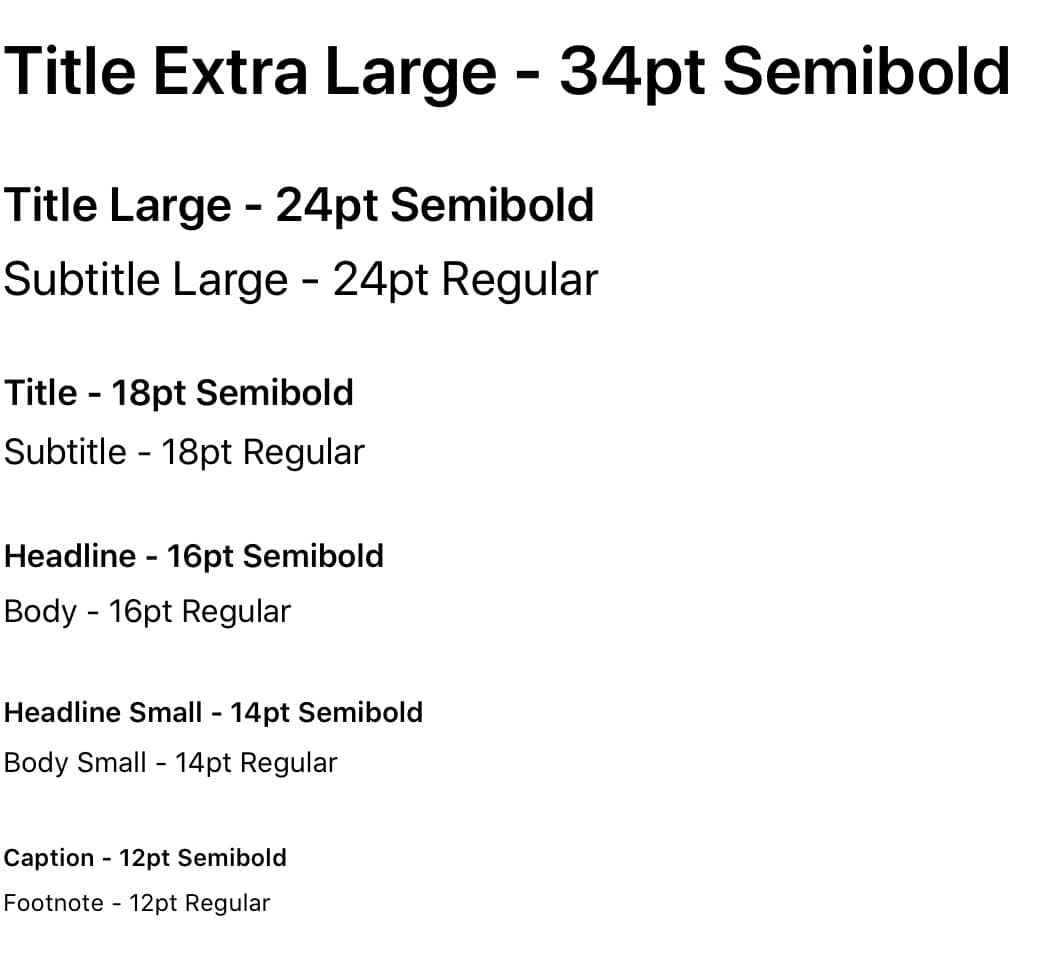
Every app contains some text, which makes styling text an important component of your app. Most likely you’re using San Francisco the default iOS font within your app, and you probably encountered the default text styles that Apple offers. The great part about these are that they support Dynamic Type right out of the box, but I often found them to be too limiting. The following 11 text styles are the ones I regularly use, most of them come in a Regular and Semibold variant, making them versatile while still supporting Dynamic Type:
extension UIFont {
	static let titleExtraLarge: UIFont = font(ofSize: 34, weight: .semibold)

	static let titleLarge: UIFont = font(ofSize: 24, weight: .semibold)
	static let subtitleLarge: UIFont = font(ofSize: 24, weight: .regular)

	static let title: UIFont = font(ofSize: 18, weight: .semibold)
	static let subtitle: UIFont = font(ofSize: 18, weight: .regular)

	static let headline: UIFont = font(ofSize: 16, weight: .semibold)
	static let body: UIFont = font(ofSize: 16, weight: .regular)

	static let headlineSmall: UIFont = font(ofSize: 14, weight: .semibold)
	static let bodySmall: UIFont = font(ofSize: 14, weight: .regular)

	static let caption: UIFont = font(ofSize: 12, weight: .semibold)
	static let footnote: UIFont = font(ofSize: 12, weight: .regular)

	private static func font(ofSize size: CGFloat, weight: UIFont.Weight) -> UIFont {
		return fontMetrics(forSize: size).scaledFont(for: .systemFont(ofSize: size, weight: weight))
	}

   private static func fontMetrics(forSize size: CGFloat) -> UIFontMetrics {
		switch size {
		case 34: return UIFontMetrics(forTextStyle: .largeTitle)
		case 24: return UIFontMetrics(forTextStyle: .title2)
		case 18: return UIFontMetrics(forTextStyle: .title3)
		case 14, 16: return UIFontMetrics(forTextStyle: .body)
		case 12: return UIFontMetrics(forTextStyle: .footnote)
		default: return UIFontMetrics.default
		}
	}
}
Apple provides us with UIFontMetrics based on their preferred font styles, they are responsible for the scaling factor of the dynamic font sizes. Since we don’t want all of them growing at the same rate we base them off the closest Apple equivalent.
Another aspect is semantic naming of these text styles, so if we were to modify them in the future, for example their font weight, we don’t need to change the naming as a result of it, since it reflects purpose and not style.
Here is what all of these text styles look like:
Colors
The right color palette can be very important for an app. Often there is a brand color which is also reflected in the app icon, and within the tint color of important controls. Apple also has their own named colors within UIKit and added many dynamic colors with iOS 13 that adapt for Light and Dark Mode. These already feel native to iOS and I highly recommend using them as much as possible. A list of these dynamic colors can be found here.
When it comes to adding your own colors you have multiple options. The most simple is to define colors within an extension of UIColor:
extension UIColor {
	static let destructiveColor = UIColor(red: 214/255, green: 40/255, blue: 40/255, alpha: 1.0)
	static let warningColor = UIColor(red: 255/255, green: 190/255, blue: 11/255, alpha: 1.0)
	...
}
This works great as a first building block, but unfortunately these colors will not adapt to a Dark Mode theme. Defining our colors within the asset catalog offers the option to add another appearance for Dark Mode. This is a great tool especially if you are using story boards or xibs.
But if you assign most of your colors within code you have to rely on a string based API. That means typos are easy to make, and if you rename or remove a color, the compiler will not be able to help you, and your app will have unexpected behavior or worse: crash. That’s why I prefer to define these within code.
In order to add a secondary appearance of the color for Dark Mode, we’ll make use of a Property Wrapper that will return us the right color depending on the theme:
@propertyWrapper
struct DynamicColor {
	let light: UIColor
	let dark: UIColor

	var wrappedValue: UIColor {
		if #available(iOS 13.0, *) {
			return UIColor { (traitCollection) -> UIColor in
				switch traitCollection.userInterfaceStyle {
				case .dark: return self.dark
				case .light, .unspecified: return self.light
				@unknown default: return self.light
				}
			}
		} else {
			return light
		}
	}
}
An added benefit of this Property Wrapper is that it works for projects that target iOS 12 or earlier, as the light color appearance serves as a fallback value. Additionally we can also add support for a custom Theme Manager in addition to the UITraitCollection, in case you want to offer the option to override the theme.
Once we added this Property Wrapper to the codebase we can then define our colors as follows:
struct Theme {
	@DynamicColor(light: .black, dark: .white)
	static var primaryTextColor: UIColor
	...
}
You’ll notice that we can’t define these dynamic colors within an extension of UIColor since those (currently) don’t support Property Wrappers. If you still like to keep all your colors in one place, which you should, we can store them within a struct called Theme.
Icons
Icons are another important factor that determine the look of your app. Again Apple did us a huge favor with iOS 13 when they released SF Symbols, which I’ve written about previously. However sometimes you don’t find the right icon within these, or you support iOS 12 and have to add a PDF version to the asset catalog anyways. Now more than ever it’s important to select the template image option, as you are likely to change the tint color based on your theme.
Similar to the color assets, image assets use string based APIs, which come with the same drawbacks when renaming or removing. To combat this issue and give us compile time assurance, we can create a Build Phase that creates code references to these image assets at compile time. Let me know if you are interested in how to achieve this and I can share the script I use to generate these in a separate post.
Elevation
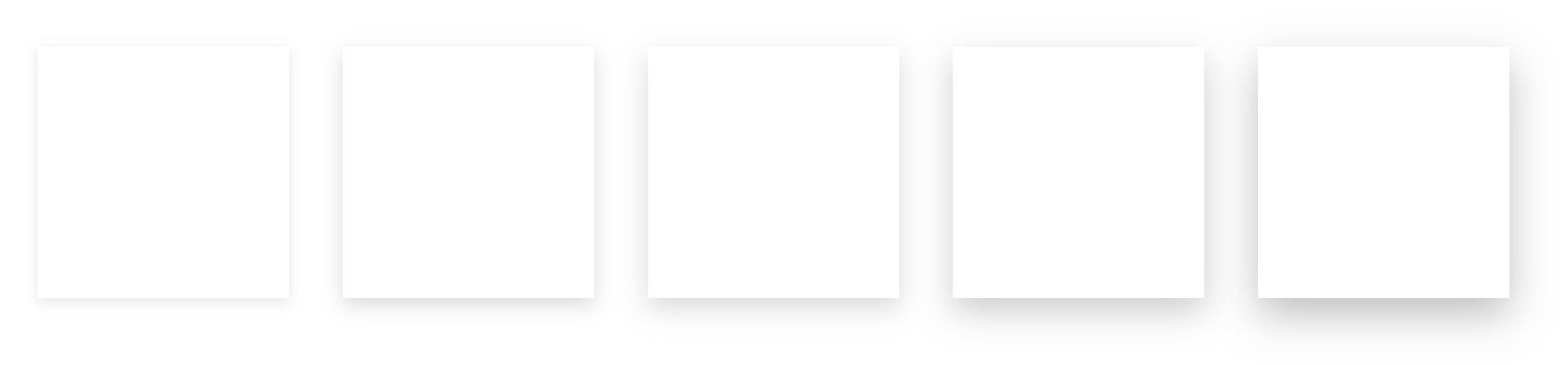
Elevations refer to the shadow applied to a view to make it appear as if it is elevated from the page. Again we use an extension, this time on UIView and a custom enum type for our different levels, which also defines the offset, radius, and opacity for each:
public enum Elevation {
	case zero, one, two, three, four, five

	var offset: CGSize {
		switch self {
		case .zero: return .zero
		case .one: return CGSize(width: 0, height: 2)
		case .two: return CGSize(width: 0, height: 4)
		case .three: return CGSize(width: 0, height: 6)
		case .four: return CGSize(width: 0, height: 8)
		case .five: return CGSize(width: 0, height: 10)
		}
	}

	var radius: CGFloat {
		switch self {
		case .zero: return 0
		case .one: return 4
		case .two: return 6
		case .three: return 8
		case .four: return 10
		case .five: return 12
		}
	}

	var opacity: Float {
		switch self {
		case .zero: return 0
		case .one: return 0.1
		case .two: return 0.15
		case .three: return 0.15
		case .four: return 0.2
		case .five: return 0.2
		}
	}
}

public extension UIView {
	func setElevation(to elevation: Elevation) {
		layer.shadowOffset = elevation.offset
		layer.shadowRadius = elevation.radius
		layer.shadowOpacity = elevation.opacity
	}
}
We also define a type for level .zero, this can be useful when you want to clear any previously set elevation.
Here is what these elevations look like in practice:
Primitives
Primitives are patterns or views that can stand on their own and be reused for many different purposes. This might include subclasses of UILabel, UITextField, or UIButton which add additional functionality or styles that you reuse throughout your project. But this could also be your own custom components and patterns, which might include things like a Bottom Sheet, Tabs, or Banners.
These Primitives are often very unique to your project and depend on your needs, which is why I’m not including specific code examples. In order to decide if a view is a Primitive or just a simple view, it’s best to ask you the following questions:
- Am I reusing this view in multiple places?
- Is it independent from project specific models?
If the answer to both of these is Yes then chances are it belongs within the Primitives of your Design System.
Summary
These are just the first steps you can take to create your own iOS Design System. Depending on your team size I highly recommend working together with a designer to get these principles in place. There are also some tools like Zeplin that can help you to retrieve colors, icons, and text styles from high fidelity mock ups produced with Figma, or Sketch. Some Design Systems go even further and also include reusable animations, or other frequently used patters. If you already have a Design System in place I’m interested to hear what is included in yours.
Next Post: