Supporting Dynamic Type with Custom Fonts on iOS
The Twitch iOS app now supports Dynamic Type, which is the iOS-level feature for dynamically changing font sizes. We added support for this system feature because we wanted to offer our users choice in selecting their preferred text size, opening the door for users who might have difficulty reading text in the app without this feature.
With the redesign last summer, we started using our own custom font, Roobert, which is used across all platforms. Additionally, we defined standard text styles, which are now used across the app. We also focused on accessibility, including adjusting our colors to improve contrast ratios between text and background, as well as adaptable font sizing.
Making app-wide changes like this doesn’t come easy. The Twitch app has many different screens and text labels, all of which need to work with scaled font sizes, on both iPhone and iPad, across many screen sizes. Fortunately the initial support for Dynamic Type can be centralized.
Starting with iOS 11, UIKit has exposed UIFontMetrics, which we can use to scale our custom font to any size. It does so by applying a multiplier to the initial point size. Because we now require a minimum SDK target of iOS 11, we can simply use UIFontMetrics, without having to rely on a separate solution for older iOS versions.
let title = UIFont(name: "Roobert", size: 18)
let scaledFont = UIFontMetrics.default.scaledFont(for: title)
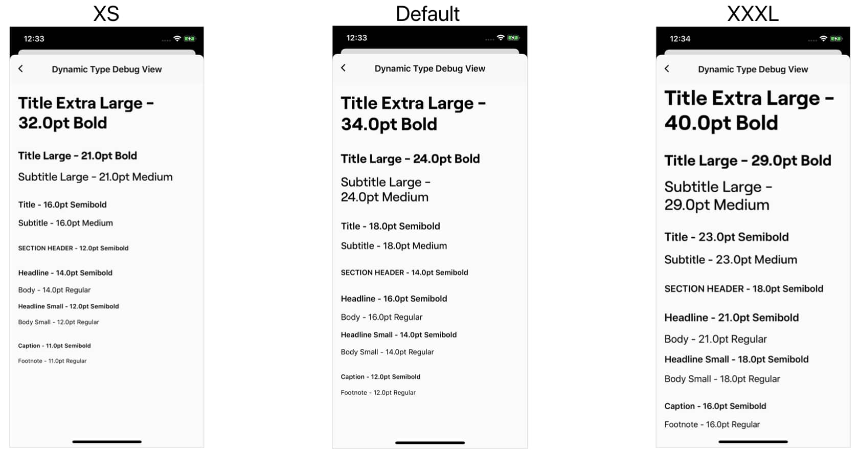
These two lines produce a scalable variant of our “Title” text style. However, we discovered that using the default Font Metrics can produce results in which we get overly large titles that scale beyond what they need to, as they already start out relatively big. In order to fix this, we were able to leverage the predefined Apple text styles as template. Each one has a different scaling behavior: the smaller ones, like .footnote and .caption, will not go below 11pt, while the .title styles will grow slower than the .body or .headline styles as they scale up.
We created the following function, which maps between our styles and the correct Font Metric we like to use.
enum TextSize: CGFloat {
    case titleExtraLarge = 34
    case titleLarge = 24
    case title = 18
    case body = 16
    case bodySmall = 14
    case footnote = 12
}

private func metrics(for size: TextSize) -> UIFontMetrics {
    switch size {
        case .titleExtraLarge:
            return UIFontMetrics(forTextStyle: .largeTitle)
        case .titleLarge:
            return UIFontMetrics(forTextStyle: .title2)
        case .title:
            return UIFontMetrics(forTextStyle: .title3)
        case .bodySmall, .body:
            return UIFontMetrics(forTextStyle: .body)
        case .footnote:
            return UIFontMetrics(forTextStyle: .footnote)
    }
}
The following code snippet then allows us to get a scaled UIFont with the TextSize and font weight we specify. If you haven’t imported your custom font, follow these steps
private enum RoobertWeight {
    case medium, bold

    var fontName: String {
        switch self {
        case .medium:
            return "Roobert-Medium"
        case .bold:
            return "Roobert-Bold"
        }
    }
}

func font(with size: TextSize, weight: RoobertWeight) -> UIFont {
    let roobert = UIFont(name: weight.fontName, size: size.rawValue)
    return metrics(for: size).scaledFont(for: roobert)
}
Once implemented, the code snippets above allow us to define a total of 12 text styles, all of which adhere to the Dynamic Font setting of the user.
At Twitch, we put these snippets into an extension of UIFont, and we gave all 12 styles distinct names so that we can easily reuse them throughout our project. Here is an example of some of these:
extension UIFont {

    // more styles

    static let twitchHeadline = font(with: .body, weight: .semibold)
    static let twitchBody = font(with: .body, weight: .regular)

    static let twitchHeadlineSmall = font(with: .bodySmall, weight: .semibold)
    static let twitchBodySmall = font(with: .bodySmall, weight: .regular)

    static let twitchCaption = font(with: .footnote, weight: .semibold)
    static let twitchFootnote = font(with: .footnote, weight: .regular)
}
The benefit of having distinct names for our fonts also means that communication between designers and engineers is easier as we have a shared language we can all use to communicate; these styles are available in both our design tool and our code, making them a part of our design system.
While adding support for dynamic font sizing we also vetted the text styles that we previously used throughout the app and made sure they work with all sizes and hierarchy is maintained.
Furthermore we optioned to use semantic names that convey intent instead of style properties, this will allow us to adjust these properties in the future without having to change the name of the text style.
And now?
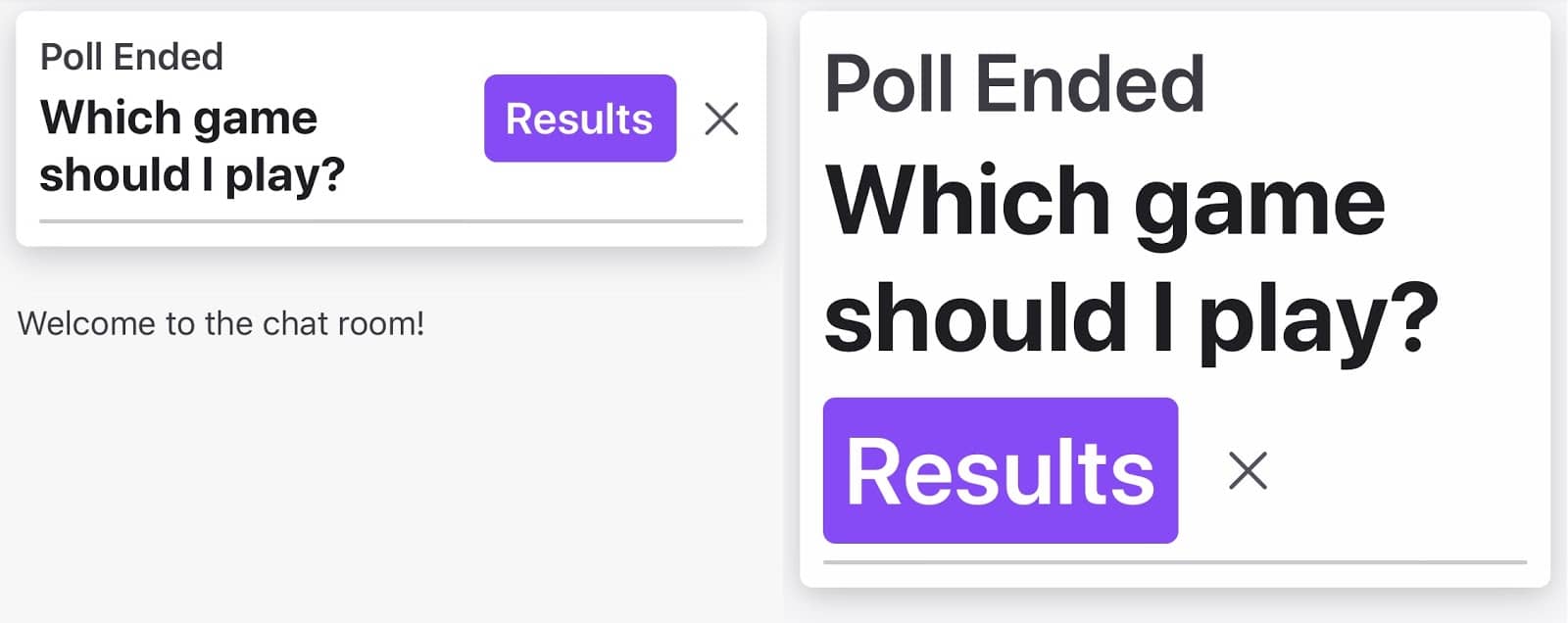
Adding support for Dynamic Type is not where the work stops, but starts. Maybe you are already localizing your app and have run into issues where labels are getting truncated. With dynamic font sizes you also have to keep in mind that text can grow vertically which can cause layout issues. You may need to add more Scroll Views, so that text at the largest sizes is still readable. Some layouts might break completely and need to be reworked. Below are some best practices that can help you tackle these newly created issues:
1. Labels
label.numberOfLines = 0
label.adjustsFontForContentSizeCategory = true
First we set the numberOfLines of the label to infinity, so that we ensure all the text is presented and not truncated. Sometimes we might only preview certain text. In that case we keep a fixed maximum of lines. However we still need to make sure that it’s a big enough number, so that text at large content sizes and in other languages is still comprehendible. Second, we tell the label to automatically adjust its text with the content category. This is especially useful for debugging purposes when you want to change the content size frequently.
2. Stack Views
static var horizontalDynamic: NSLayoutConstraint.Axis {
    return UIScreen.main.traitCollection.preferredContentSizeCategory > .accessibilityLarge ?
        .vertical : .horizontal
}

stackView.axis = .horizontalDynamic
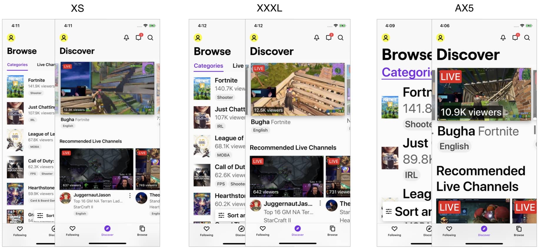
A practice that Apple also uses in their system apps is to change the layout axis of Stack Views once a certain size category is reached. This can be useful as horizontal space shrinks due to large text and the limited device width. Below is an example of how we can use this axis to layout the text and buttons in different size categories. Note how things move from being laid out horizontally to vertically as the scale increases.
3. Table Views
tableView.rowHeight = UITableView.automaticDimension
tableView.estimatedRowHeight = UIFontMetrics.default.scaledValue(for: 60)
Using automaticDimension for the Table View row height ensures that AutoLayout is used to determine the height of its cells. Furthermore we use the scaledValue(for:) function available on all UIFontMetrics to help the Table View with its layout. It is required that you supply an estimatedRowHeight when using automaticDimension and we can improve performance with passing a scaled value instead of just a static one.
4. Collection Views
func collectionView(_ collectionView: UICollectionView, layout collectionViewLayout: UICollectionViewLayout, sizeForItemAt indexPath: IndexPath) -> CGSize {
    ...
}
Unfortunately automatic cell sizing in Collection Views is a little harder to achieve than in Table Views, as these cells can have variable width and height. This topic alone could warrant another blog post and there are many good ones out there. At Twitch we often make the width of the cell static and then let it grow in height to accommodate its content.
5. Scroll Views
scrollView.flashScrollIndicators()
With dynamic font sizes we notice that content bleeds off screen more often. To still make it readable to the user we need to wrap it into a Scroll View. With the current flat design language within iOS it’s easy to miss if a screen is scrollable, especially when it’s cut off in just the right place. In order to mitigate this, and signal to the user that there is more content off screen, we flash the scroll indicators.
Next Steps
Moving forward, we have to be cognizant about using AutoLayout constraints that adapt to accommodate large texts. This is easier for screens that rely on reusable components, as these are often optimized for variable text length and height. However our app has a lot of screens, which is why we scheduled time with the whole iOS team to sit down and walk through the app to identify areas that have layout issues with large text sizes. We haven’t addressed all areas yet, but are on the way to optimize every screen to deliver a consistent, and delightful experience to all our users.
Next Post: